News from Pratt Center: November 2020
- Introducing Pratt Center’s new visual identity
- How good design advances mission
- Embodying democracy, equity and sustainability: Pratt Center’s new website
- A Leaner, Cleaner Website for Pratt Center
- Four Common Mistakes to Avoid When Designing Your Website
- What We’re Reading
Table of Contents

Stepping back and reflecting on where you’ve been and where you’re going is a necessary task for every mission-driven organization. After revisiting and updating our 5-year strategic plan in 2018, we began a new process in 2019 to deepen our commitment to racial justice in all of our policies and practices, which resulted in our Racial Equity Action Plan. It became clear through both these processes that—in the face of a grave climate crisis, threats to our democracy, and the ugly persistence of racism at all levels of our society—Pratt Center's work and the unique way we approach it has never been more important.
It also became clear that these urgencies would be better served by new tools for communication, both internally among our team, and externally with our partners, supporters and the wider world. In 2019-2020, we collaborated with designer Yeju Choi to crystallize, organize and visualize the unique set of values and attitudes core to Pratt Center's identity.
This issue of our newsletter is dedicated to sharing more about that process and its outcomes in hopes that it can aid others on a similar path.
Introducing Pratt Center’s new visual identity
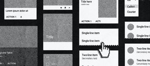
If you’ve visited our website recently, you might have noticed our new look. The website represents the culmination of a two-year process of collaboration with designer Yeju Choi to create a visual identity that more authentically communicates our mission and values and helps us align our projects and public-facing materials in one unified system.
Our new logo may seem plain at first glance, but it’s in the subtle details and applications where our unique identity shows through—in how our long name is broken into two parts, in the elevation of “Community Development,” and the juxtaposition of the concrete and the open and porous elements. The positioning of the logo on the bottom left is also an integral part of the identity, representing how we work—on the ground alongside and supporting those community groups at the forefront of the movement for racial, economic, and environmental justice.
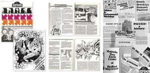
This new identity celebrates our nearly 60-year history by reviving some of the visual and verbal elements of Street, a magazine published by Pratt Center in the 1970s that we believe is as relevant today as it was in our early years. Street Magazine covered a variety of urban environmental issues, big and small, from legislative actions to street tips on how to throw a block party, in a robust and dynamic yet no-frills verbal and visual language. Click to browse digitized versions of Street Issue 7 (1972) and Issue 15 (1975) in their entirety.
How good design advances mission

We spoke with Yeju Choi, the designer and creative director of Pratt Center’s brand identity, about the importance of trust building in the design process, and how an effective organizational identity serves as a tool for inward reflection as much as outward presentation. Part of stewarding identity, she explains, “means letting the identity speak to you about your core qualities and attitudes and ask you questions in everything you do—in the visuals you produce, but also in your writing and communications.”
Embodying democracy, equity and sustainability: Pratt Center’s new website
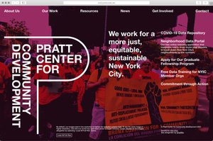
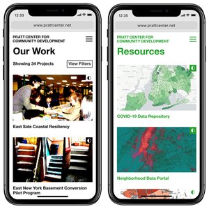
In the final step of the identity design process, we worked with Yeju and the web development team at GrayBits to build a new website that has a reduced energy footprint and prioritizes direct access to information. By cutting out extraneous styling and visual elements, and rendering images in low-resolution, the site makes a noticeable break from the conventional marketing-driven approach to web design. We recently spoke with GrayBits about the website and the thinking behind it. Read the Interview
A Leaner, Cleaner Website for Pratt Center
How the new prattcenter.net embodies our commitment to environmental sustainability, and ranks cleaner than 91% of other sites that have been tested. Read more
Four Common Mistakes to Avoid When Designing Your Website
In a conversation following the launch of Pratt Center's new website in August 2020, our development team at GrayBits offered the following dos and don’ts for nonprofit organizations when approaching a new website project. Read more
What We’re Reading
Ending Exclusionary Zoning In New York City’s Suburbs
NYU Furman Center
For Next Steps In City's Green New Deal and Covid Recovery, Coalition Offers Plan For 100,000 Climate Jobs
Gotham Gazette
In U.S. Cities, the Health Effects of Past Housing Discrimination Are Plain To See
NPR
U.S. Election Maps Are Wildly Misleading, So This Designer Fixed Them
Fast Company
It’s 2020: Why Is the Internet Still Treated Like a Luxury, Not a Utility?
Gothamist
The Volunteers Blanketing Cities With Wireless Internet
MIT Technology Review