Embodying democracy, equity and sustainability: Our new website
In the first half of 2020, Pratt Center worked with Yeju Choi and the team at GrayBits to build a new website that has a reduced energy footprint and prioritizes direct access to information. By cutting out extraneous styling and visual elements, and rendering images in low-resolution, the site makes a noticeable break from the conventional marketing-driven approach to web design. In October 2020, Pratt Center's Ben Dodd spoke with Branimir (Brana) Vasilić and Rahul Subhash Shinde of GrayBits about the new design and the thinking behind it. An edited version of the conversation is below.
Pratt Center: Tell us about your personal paths into web development and how Graybits got started?
Brana: My background is in physics, but I always did a lot of web interfaces on the side. So I was doing a post-doc at Penn and had been wanting a change of pace so I eventually switched to doing freelance development work full time. I realized pretty quickly that to provide the service that I wanted to the clients, it needed to be a full-service company, which handled everything—design, development, and project management. Rahul and I share the same approach to web design and operating a business so we hit it off right away. Then, since we were growing we needed the business piece and an organizational person, and Isabel seemed a perfect match.
Rahul: My mom is actually also a graphic designer. She went to one of the first design schools in India, and then came to the U.S. for her Masters. When I was younger, she would go to do proofs at printers in New York City, and I would come with her, so there was a lot of early exposure to graphic design. Halfway through school at Maryland Institute College of Art, I realized I was interested in front-end development, programming and computers. I met Brana right after graduating.
Brana: Rahul is quite unique in that he is interested in and excelled at the technical part of the web, and didn’t treat it as a hindrance. It gives us an edge to have an excellent designer that’s also familiar with the underlying technology with such depth.
Can you talk about some of the ways environmental sustainability factored into the development of the site, and the treatment of images specifically?
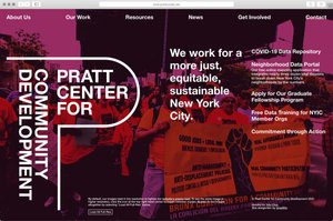
Rahul: Page sizes and energy load are hugely dependent on the number and size of images. The first website I saw that directly addressed this was low-tech magazine—which has a mirror of their site that’s run on a solar-powered server and displays images in monotone. Having worked with a lot of galleries in the past—where image-heavy sites and large video files are the norm—this had been on my mind for a while. And given how much we talked about sustainability in the context of Pratt Center’s mission, images were the first object on the page that it made sense to try to lighten. We did that by having the site initially load images in low-resolution, and introducing a button to load the full-resolution version. (Learn more about his feature here)
Light websites are not only energy efficient, they are also generally more effective. If you have something bloated and large in size, it’s going to be harder to interact with. So as with most of our projects, we kept styling and reliance on scripting to a minimum, and had the server do as much of the pre-rendering as possible so it can easily be cached on the user end.
Brana: We have an additive approach to design. We only add things that are necessary. If you’re building a website for a videographer, large videos are necessary. But if you have a website that can do without and still be functional, why add them? It comes back to solving the problem, and having reasons for all the decisions that are made.
Large images often come from marketing considerations. If you’re not selling something, do you really need to see all the images? If you see a map, that’s useful. If you see a relatively generic shot of people, does that truly help you compared to actually reading the text about the project, which is orders of magnitude smaller than a huge image of people?
We are interested in considerations like this, but the client also has to be open to it. Pratt Center was an institution that understood this, embraced it, and didn’t look at it as just a veneer on the website. We were glad to build a site like Pratt’s because it becomes an example of how things can look, with good reasons to support those decisions.
This expectation of what images should be didn’t just magically appear in people’s brains. They were taught to expect that by the proliferation of marketing images. That’s why organizations like Pratt are important, because you had the guts to actually push back and try to educate in a different direction, showing that you can have other considerations when presenting yourself beyond selling things. We were really grateful that you were open to something like this because it serves a larger purpose.
One of the things we learned in this process was how web technology has a pretty significant energy footprint that often gets overlooked. Can you say more about that?
Brana: I don’t think this is much different than anything else. Living in an industrialized society, we abstract away all of the infrastructure. You flip the switch, the light goes on. You turn on the faucet, water comes out. You have these very small touch points to this vast infrastructure, that’s extremely complicated and oftentimes fragile, but you treat it as something that’s infinite and always there because so much of your life depends on it. You’re not chopping wood to put it in the furnace to heat your house. There is a total disconnect between what’s involved in heating your house and what you’re experiencing which is controlling a thermostat, or paying the bill.
The web is an extension of this. You push a button and stuff shows up, and the fact that there is a layer of servers and wires and enormous infrastructure behind it gets lost. I was at a party which had the burning logs playing from Youtube. When you think about all the servers that were between that screen including the computer, it’s probably burning the same amount of heat as if you just lit an actual log.
One of the other priorities for the site was that it be accessible to users who may have disabilities. Part of that meant following guidance from the Web Content Accessibility Guidelines (WCAG) 2.0. What did this mean for how the site was built?
Rahul: One of the things from the jump we decided on the Pratt Center website is that we wouldn’t use slide shows. The bulk of our work on other sites that had to retroactively become WCAG compliant went to slide shows, and there are lots of other features that are not web native that inherently produce these more confusing interfaces.
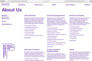
We also started with a more semantic layout that prioritizes order of information, reduces nesting of content, and allows individuals more direct access to what is being presented rather than having to go back to make it functional later.
Brana: WCAG 2.0 standards are 12 years old now and some of the design decisions we made on Pratt Center’s site like color contrast and text legibility are just baked into our normal process. But it’s still common—because of aesthetic concerns and misunderstanding of the technology and medium of web design—to see them disregarded. Building for accessibility is very complex because it touches content (client's content has to be accessible) it touches technology (the accessibility of the site layout and interface); and it touches design (aesthetic decisions are often constrained by accessibility requirements). You have to consider all of the parts of the website to make things work.
There are companies solely dedicated to assessing compliance. Because there are so many different platforms and readers and types of software platforms, they go through websites and assess if what has been done actually satisfies in the real world. For example, the content part of what gets tagged in images and descriptions can be subjective. If I’m browsing a website with a screen reader, is what I’m hearing annoying, too much information, or is it appropriate even if it might not nominally satisfy some requirements?
I really appreciate all the questions, because this conversation illustrates all the complexities involved in web design. It’s not just how it looks. In this hour now, we’ve gone through a range of issues that have to be considered before you finally get to a scrolling page. And the scrolling page is the last surface layer of all these other decisions and considerations that have to be made to get there.